📊 AI Call Monitoring Dashboard
The AI Call Monitoring Dashboard provides comprehensive real-time analytics and insights for your call center operations. This powerful dashboard helps you monitor performance, track key metrics, and optimize your call center efficiency.
🔍 Overview#
The dashboard is designed with a dark theme and features multiple sections for different types of analytics:
- Top Navigation & Filters - Control and filter your data view
- Key Performance Indicators (KPIs) - Quick overview of essential metrics
- Analytics Charts - Detailed visualizations of call data and trends
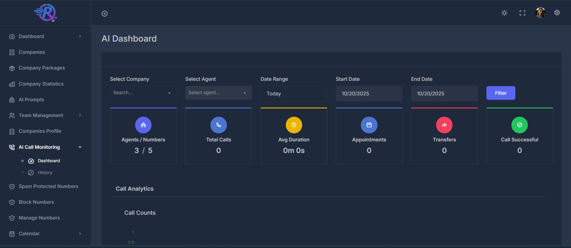
The AI Call Monitoring Dashboard provides a comprehensive view of your call center operations with real-time analytics and performance insights.
🎛️ Top Navigation & Filters#
🎮 Main Controls#
- Dialer Button - Quick access to dialer functionality
- Search Bar - Search across all data
- Filter Button - Apply selected filters
🔧 Filter Options#
🏢 Company Selection#
- Filter data by specific companies
👤 Agent Selection#
- Filter data by individual agents
📅 Date Range Controls#
- Set custom date ranges for data analysis
⚙️ Utility Icons#
- Theme toggle, full-screen mode, settings, and user profile
📈 Key Performance Indicators (KPIs)#
The KPI cards provide a quick overview of essential call center metrics at a glance.
1. 👥 Agents / Numbers#
- Active agents and available phone numbers
2. 📞 Total Calls#
- Total calls made within the selected time period
3. ⏱️ Average Duration#
- Average length of calls
4. 📅 Appointments#
- Appointments scheduled from calls
5. 🔄 Transfers#
- Calls transferred to other agents or departments
6. ✅ Call Successful#
- Successful calls meeting defined criteria
📊 Analytics Charts & Visualizations#
The dashboard features multiple chart types to provide comprehensive insights:
📈 Call Volume Analytics#
📊 Call Counts (Bar Chart)#
- Track daily call volume trends
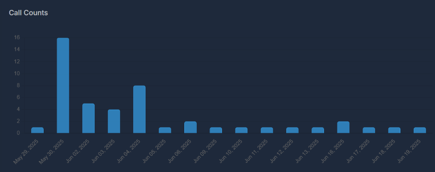
Bar chart showing daily call volume trends over time.
📞 Call Picked Up Rate (Line Chart)#
- Monitor how often calls are answered
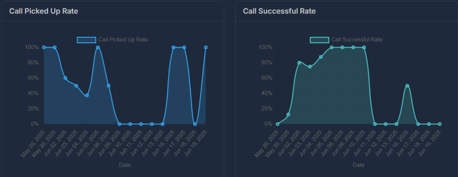
Line chart tracking call pickup rates and performance trends over time.
🏢 Company Performance Overview#
The dashboard displays company-based analytics in a three-column layout for easy comparison:
📅 Appointments by Company#
- Compare the number of appointments scheduled by each company.
🔄 Transfers by Company#
- See how many call transfers occur per company.
🍩 Calls by Company (Donut Chart)#
- Visualize the distribution of calls by company.
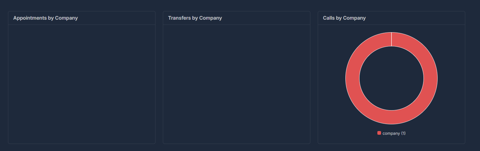
Dashboard section with three cards: Appointments by Company, Transfers by Company, and a donut chart labeled "Calls by Company" that visually displays call volume segmented by company (as shown in the screenshot above). The donut chart legend marks different company IDs with unique colors.
🏢 Company Performance#
📅 Appointments by Company#
- Track appointment scheduling by company
🔄 Transfers by Company#
- Monitor call transfers by company
🍩 Calls by Company (Donut Chart)#
- Visualize call distribution across companies
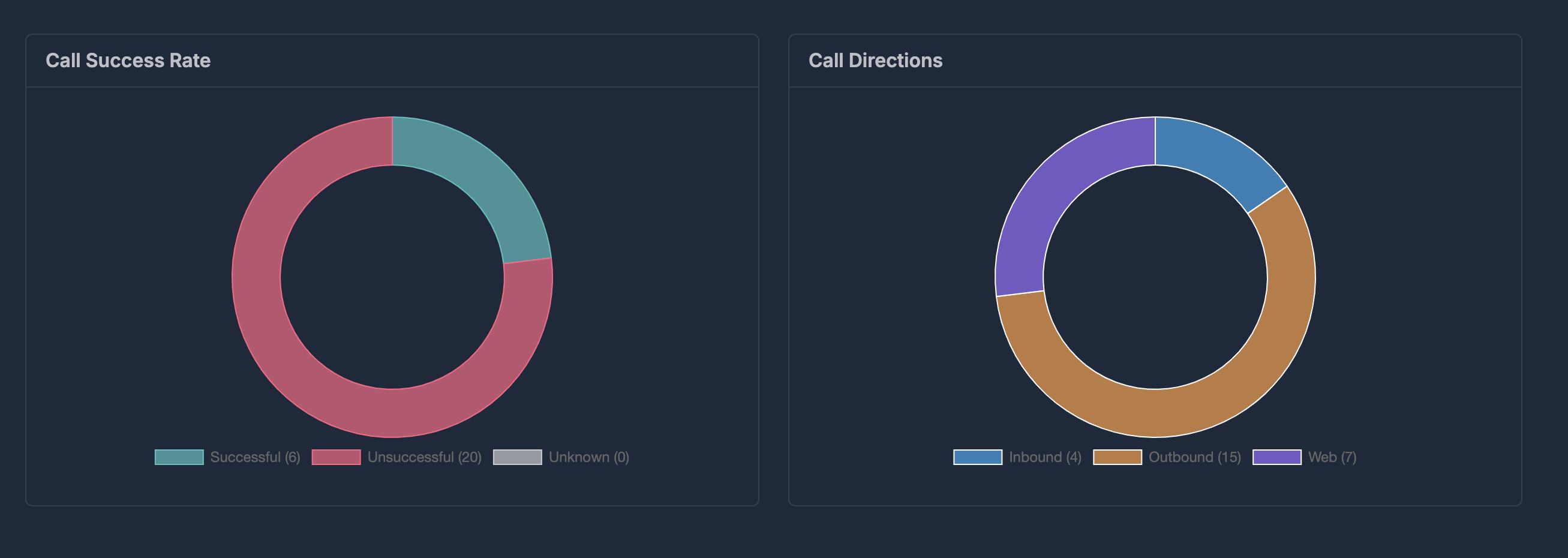
Donut chart showing call distribution by company and direction.
🎯 Call Quality Metrics#
✅ Call Success Rate (Donut Chart)#
- Track overall call success rates
🧭 Call Directions (Donut Chart)#
- Analyze call source distribution
❌ Disconnection Reasons (Donut Chart)#
- Understand why calls end
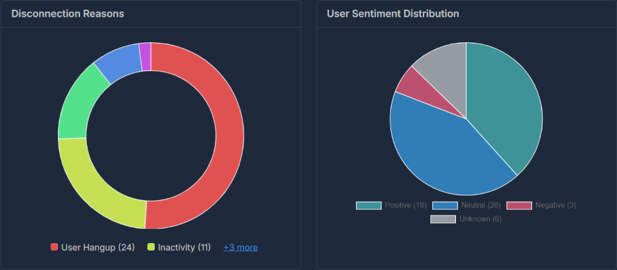
Donut chart analyzing the reasons for call disconnections.
😊 User Experience Analytics#
😊 User Sentiment Distribution (Pie Chart)#
- Monitor customer satisfaction and sentiment
📈 Performance Trends#
✅ Call Successful Rate (Line Chart)#
- Track success rate trends over time
🔄 Call Transfer Rate (Line Chart)#
- Monitor transfer rate trends
📧 Voicemail Rate (Line Chart)#
- Track voicemail usage patterns
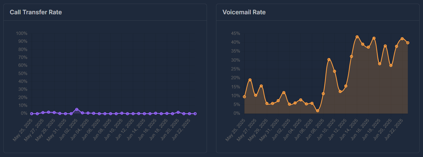
Line charts showing transfer and voicemail rate trends over time.
⏱️ Average Call Duration (Line Chart)#
- Monitor call length trends
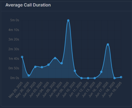
Detailed line chart tracking average call duration trends over time.
📊 Additional Analytics#
📅 Appointments Panel#
- Track appointment scheduling trends
🔍 Data Interpretation#
📊 Current Sample Data#
The dashboard shows data for a single call event, which explains why many charts show limited data points.
💡 Best Practices#
🎯 Using the Dashboard Effectively#
- Set Date Ranges: Use date picker for relevant time periods
- Filter Data: Use company/agent filters for specific areas
- Monitor Trends: Watch line charts for performance trends
- Track KPIs: Check KPI cards for quick overview
- Analyze Sentiment: Use sentiment data to improve experience
📊 Interpreting Charts#
- Donut Charts: Show distribution and proportions
- Line Charts: Display trends over time
- Bar Charts: Compare quantities across categories
🔧 Troubleshooting#
⚠️ Common Issues#
Empty Charts: Check date range settings, filters, and data availability
Zero Values: May indicate no activity, restrictive filters, or limited historical data
Missing Data: Verify date ranges and filter settings